Grids feature on many STRUMIS forms. They have their own controls, which are listed when you click the Grid Options button. Before you begin to set grid options, however, you can:
§ Click a column header to sort information into alphabetic or numeric order. Click it again to sort the information into reverse alphabetic or numeric order. Hold down the SHIFT key and click a column header to apply a secondary sort.
§ Rearrange the columns in the grid. To do this, click, hold and drag a column header to a different location.
The following options are available when you click the Grid Options button.
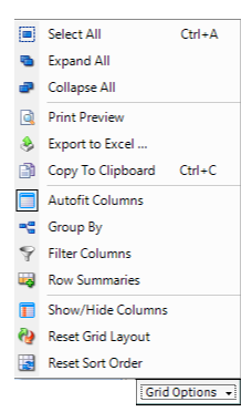
§ Select All
Selects all of the rows in the grid. You can also click a row and press
Ctrl A to select all of the rows, which
is a common function present in all data selection locations across the
system.
§ Expand All and
Collapse All
Some grids contain rows that you can expand to display extra information
(click the + sign at the beginning of the
row) or collapse to hide the information (click the -
sign at the beginning of the row). Here's an example from the Cutting
Plan Viewer:
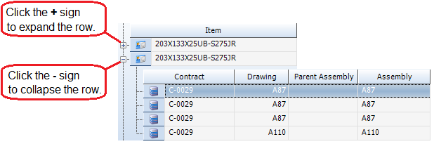
To expand or collapse all of the rows in this type of grid, use the Expand All or Collapse
All options respectively.
This can also be used when the Group By option
is applied to a grid.
§ Print Preview
This option displays the Print Preview form,
where you can check and then print the grid.
§ Export to Excel
Opens Microsoft Excel and exports the information in the grid as it is
currently formatted. Once exported, the information in excel will be seen
as alphanumeric and no formulas will be present. If the data is chosen
to be pushed to excel from a report, upon request STRUMIS can provide
templates to handle this data effectively.
§ Copy to Clipboard
Copies the information in the grid to the clipboard. You can then paste
the information into a third-party software package such as Microsoft
Excel.
§ Autofit Columns
With Autofit Columns on, STRUMIS
will adjust the width of the columns so that they fit into the window.
Turn Autofit Columns off to extend columns
beyond the width of the screen.
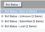
§ Group By
This option allows you to group the information in the grid by a specific
column. When you select the option, a message, Drag
a column header here to group by that column, is displayed at the
top of the grid. The example below shows how to group contracts by customer
name. Drag the Customer column header to the grey area as shown:
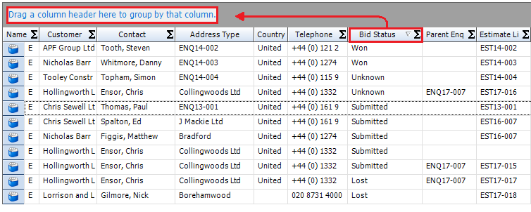
You can see that the grid now lists the customers and allows you to expand
each row to display the associated contracts. Use the Expand
All and Collapse All options to view
the grouped rows.
To display the information in its original format, simply drag the column
header from the grey area back to the grid.
§ Filter Columns
See Filter columns below.
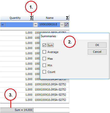
§ Row Summaries
This option allows you to add various summaries to the bottom of a column.
The range of summary types that are available depends on the column; for
example, Average and Sum
are only available when being applied to columns containing numeric values.
When you select this option, a summary icon is added to the column headers in the grid. To select a summary:
a. Click the icon.
The Summaries form is displayed.
b. Select one or more types of summary and click OK.
c. The summary is added to the bottom of the column.
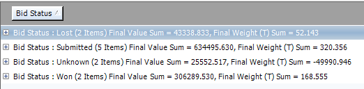
§ Combining Row Summaries with Group By
If you have applied row summaries to a numerical column, and then apply the group by option, these totals are visible in the group by headings. Each total is listed against the name of the column it associated with. The example below shows grouping by Bid Status on the Enquiry search grid, with row summaries applied to both Final Weight and Final Value.
§ Show/Hide Columns
See Show/Hide columns
below.
§ Reset Grid Layout
Resets the grid layout to the factory settings. Only use this option if
you do not wish to keep any changes you have made to the layout of the
grid.
§ Reset Sort Order
Resets the sort order of the grid to the factory settings.
STRUMIS provides a sophisticated facility that allows you to filter grids so that they display the exact information that you require. For example, on the Contracts Search form, you could list the jobs that you won this month, by building type, tonnage and sales area.
The available filter options are described below.
When you select the Filter Columns grid option, an extra row is displayed at the top of the grid. The various utilities in this row allow you to display very specific information in the grid by filtering the information to show only the details in which you are interested.
The example below shows the extra row for the Contracts Search form.
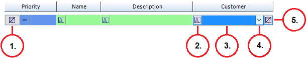
The following table tells you about the numbered features in the illustration:
Number |
Description |
1. |
This button, at the beginning of the row, clears all filter criteria for the grid. |
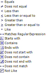
2. and 3. |
These features are available for every column. They are displayed when you click the filter row for a particular column. Click the button (feature number 2.) to display the filter operators; they are:
Select an operator and then type in an operand (at feature number 3.). These terms may be unfamiliar to you, so let's take a look at an example. Imagine that you had a list of contracts for a variety of customers. You want to review the contracts for Peabody Steel Frames Ltd. On the Contracts Search form, enable the Filter Columns grid option. In the Customer column, select the Contains operator and type in the operand "Peabody". The grid is filtered as you type. It now shows only the contracts for customers with "Peabody" in their name. |
4. |
This button is available for every column. It is displayed when you click the filter row for a particular column. When no filters have been applied to the column, the drop-down list contains every unique record in the column along with the following options. § Custom § Blanks § NonBlanks If you have applied filters, the drop-down list shows only records that match the filter criteria. Select an option from the drop down list. |
5. |
This button is available for every column. It is displayed when you click the filter row for a particular column. Click this button to clear the filter criteria for the column. |
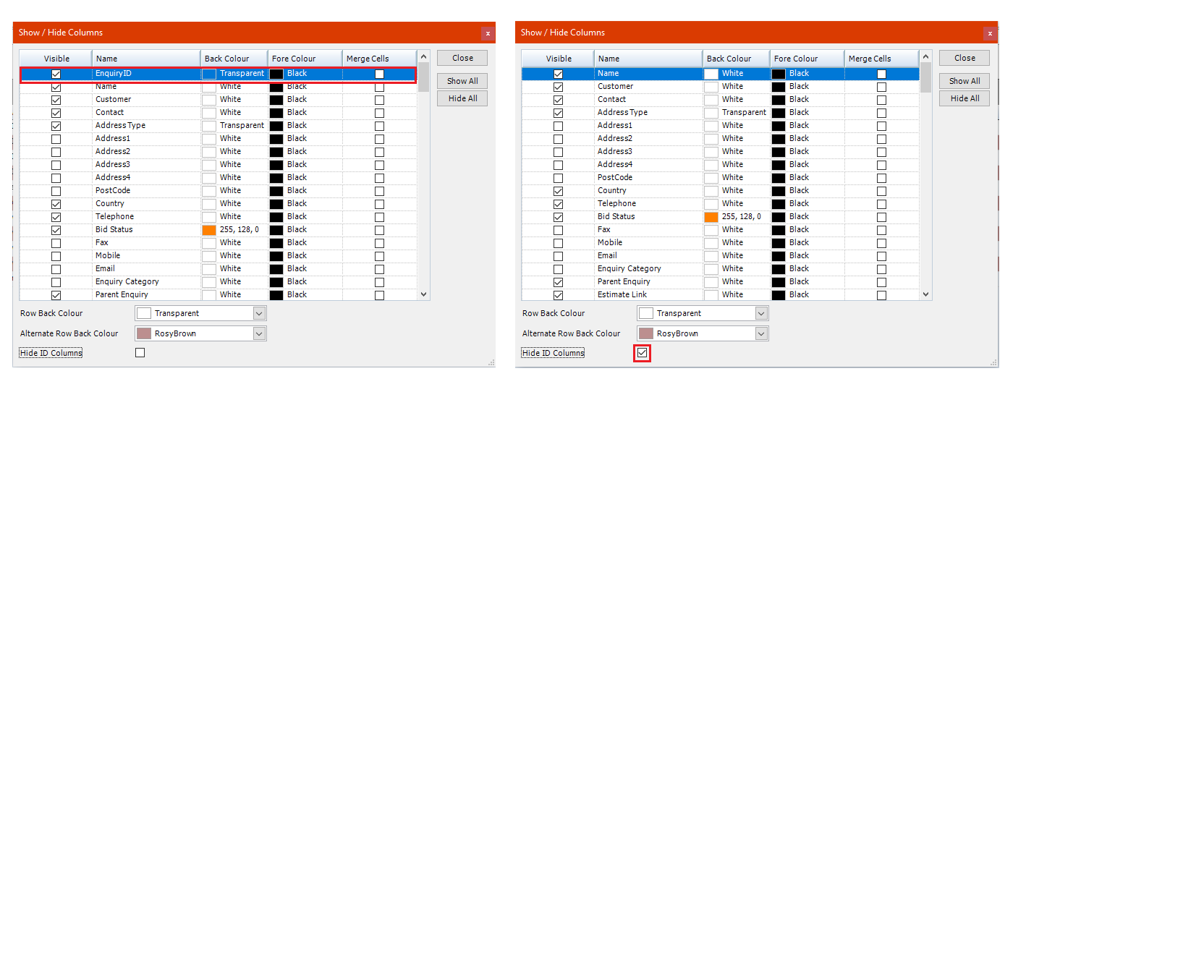
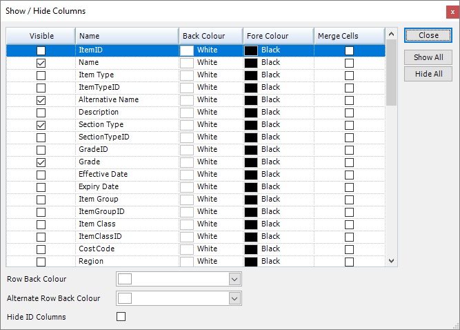
Throughout the system, the grids typically show a subset of the information that is available. When you select the Show/Hide Columns grid option, the Show/Hide Columns form is displayed. It allows you to choose the columns that you want to see in the grid by checking the Visible column, and colour code them for easy viewing.
|
Any colour choices will be saved against the WINDOWS user profile (stored in app data folder) not the STRUMIS user name. Therefore, a number of different users can log in to the same machine (on the same WINDOWS profile) using different STRUMIS log in credentials and retain the grid layouts originally set. |
Colour adjustment for column backgrounds
To colour code columns follow these simple steps:
Open the show/ hide columns window from the Grid Options menu.
Sort the names of the fields to find the one that needs to be highlighted.
Make sure the column is visible by checking the box in the Visible column.
Highlight the line to be adjusted by clicking on it.
To change background colour of the column, click on the arrow in the Back Colour column. The background colour will be set to "White" as default.
This will open a drop down menu with three different colour swatch options, which can all be used, depending on the user's preference.
Custom
Web
System
When the colour has been chosen, the grid column selected will be adjusted in real time.
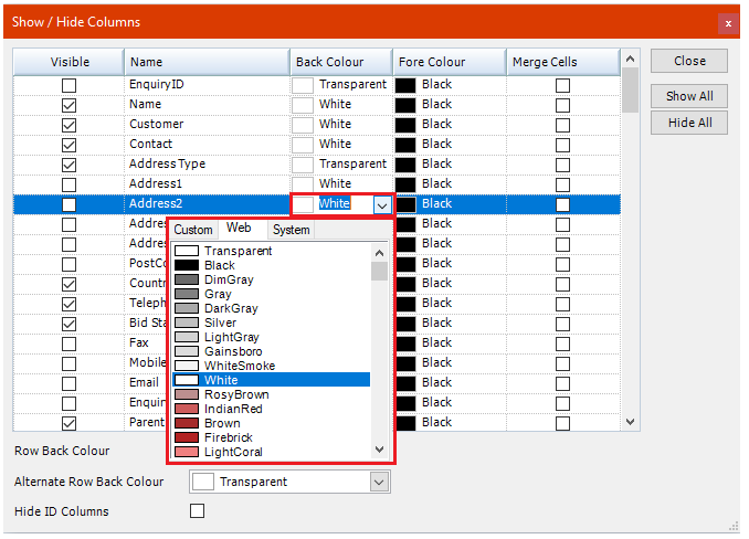
Colour adjustment for column Text
To colour code text in tables, follow these simple steps:
Open the show/ hide columns window from the Grid Options menu.
Sort the names of the fields to find the one that needs to be highlighted.
Make sure the column is visible by checking the box in the Visible column.
Highlight the line to be adjusted by clicking on it.
To change background colour of the column, click on the arrow in the Fore Colour column. The background colour will be set to "Black" as default.
This will open a drop down menu with three different colour swatch options, which can all be used, depending on the user's preference.
Custom
Web
System
When the colour has been chosen, the grid column selected will be adjusted in real time.
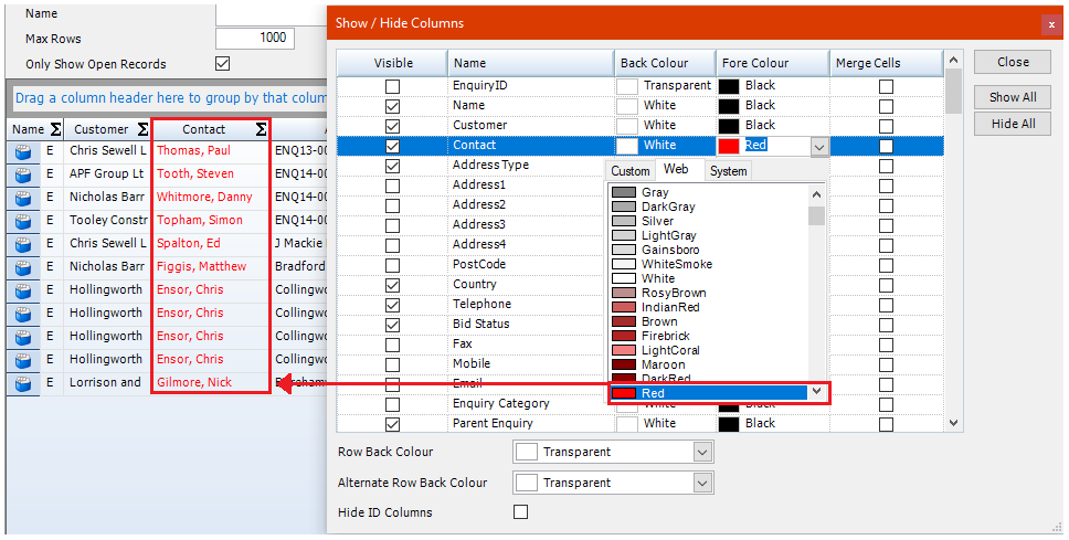
Other options within the Show/Hide Columns window that are available to manipulate grid appearance include options to adjust row colours and the merging of row data. These functions are described below.
Row Back Colour
This function applies the selected colour (chosen from the drop down box in Show/ Hide Columns) to the alternate rows in the grid. Any columns that have already been coloured (see Colour adjustments for column backgrounds) will remain the same and not receive the new format.
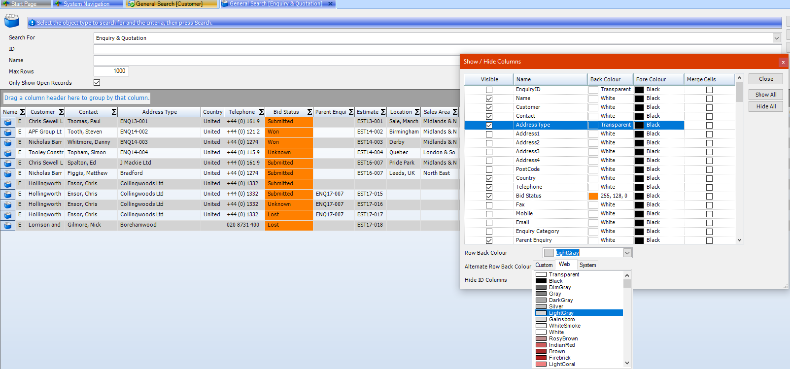
By selecting a secondary colour using Alternate Row Back Colour, the rows that were not affected by using Row Back Colour can also be changed.
These colour changes can either be used together or independently.
|
Colour changes apply to only the grid that the changes occurred in. They do not affect the appearance of grids in any other area of the system. |
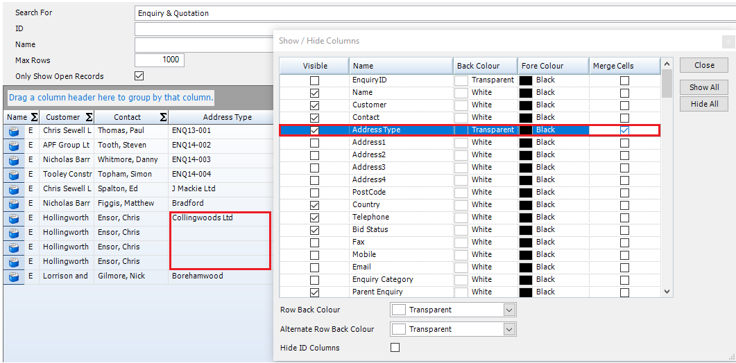
Merge Cells function
Merging cell data removes repeated fields that are identical and populates only a single entry, leaving the repeated fields blank.
An example of this would be if the "address type" in the enquiry search grid was repeated across multiple enquiries, by selecting Merge Cells in the Show/Hide Columns screen the entries will appear as per the example below. The entry for "Collingworth Ltd" appears only once despite there being four instances of this in the grid. It is important to note that this function does not delete data but rather helps to make the data in the grid easier to work with if there are a large amount of repeated information.
Hide ID columns
ID numbers in STRUMIS represent the order in which data has been stored in the database. An Example would be an Id number of 1 being the first entry and an ID number of 2100 being more recent. For administration purposes ID numbers are therefore searchable in lots of grids. If A user does not wish to see the ID number fields when searching through the Show/Hide Columns window, there is a simple check box function to remove them from view. This can be done by selecting the Hide ID Columns check box at the bottom of the window.